Knowledge Base
Exporting / analysis in Excel
Question
How do I export data from PingPlotter into Excel, and then see the average times and packet loss?
Solution
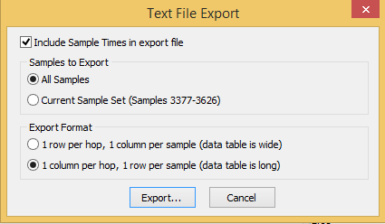
PingPlotter allows you to export data to a text file (File -> Export to
Here are the settings you might use during the export (note that you can focus in a certain time period by using the PingPlotter interface to find a period in question, set your "Samples to include", and then when you go to export, these settings will be pulled in to the export dialog).
If you select "1 row per hop", the data table will be wide. When you export, there will be a "Sample Times" header, and a "Hop" header. Under "Sample Times," there will be a list of all the hops (DNS name followed by IP address), and under "Hop," there will be a list of timestamps. Beneath the sample times will be a row corresponding to every hop in the route, with a sample latency value corresponding to the timestamps.
If you select "1 column per hop", the data table will instead be long. When you export, there will be a "Host Information" header, and a "Sample Information" header. The "Host Information" section will contain a list of each hop (DNS name followed by IP address). The "Sample Information" section will contain a timestamp, followed by the sample latency value for hop 1, then hop 2, and so forth, for that timestamp.
If you see an asterisk (*) on any of your sample latency values, that means that we did not receive a response for that sample.
This will get you a file that you can then import into Excel and do some statistical analysis and graphing. Only the raw data is included (no min/max/avg/PL%), so you'll need to add columns to calculate those values. Here is an example spreadsheet and dataset that does this:
PingPlotter Excel Import Example.zip (~700K)
Note that this isn't a template, it's an example. You'll have to do some work to make it all solve the issues you're after.
If you come up with a nice graph you think others would find useful, or some techniques for making this easier/better, please send it to us at support@pingplotter.com and we'll add it to our knowledge base.